Theme
Open the settings within the user interface and navigate to the Theme tab. Here you can customise the look of the widgets through various styling options. To achieve a uniform design, the most settings apply to all widgets. In general, five adjustments are available:
Cart Button
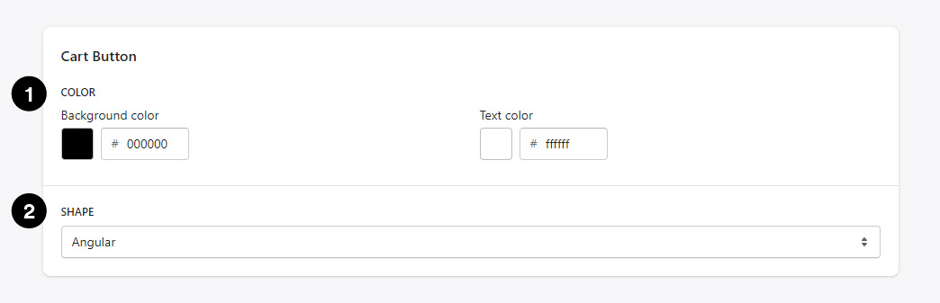
1. Color
Here you can set both the background color and the text color for all add-to-cart buttons. With Mouse Over, the selected color is automatically dimmed.
2. Shape
The add-to-cart buttons can be displayed in either a angular or rounded shape.
Checkbox
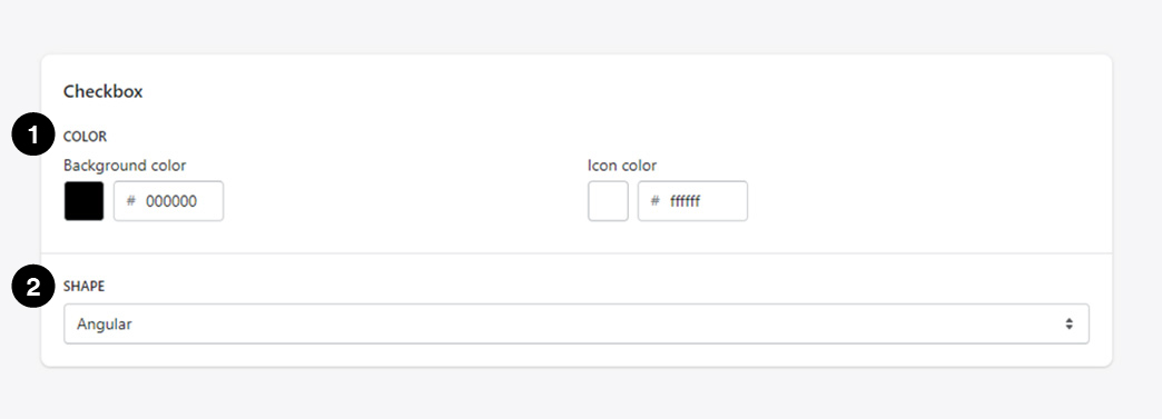
1. Color
Here you can choose the background color and the color of the checkmark icon. As only the Frequently Bought Together widget has a Checkbox, the settings only apply to this widget.
2. Shape
The Checkbox can be displayed in either a angular or rounded shape. As only the Frequently Bought Together widget has a Checkbox, the settings only apply to this widget.
Dropdown
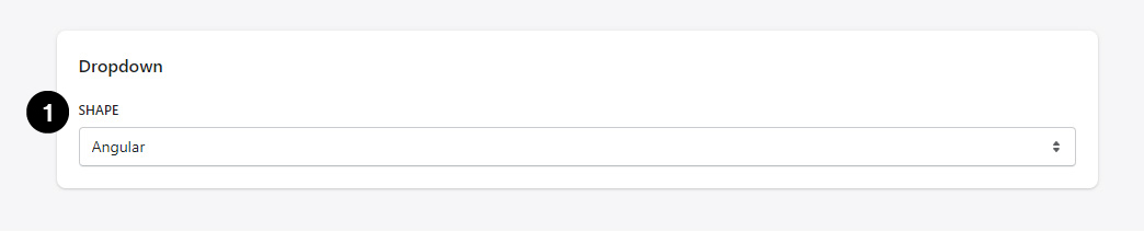
1. Shape
The Dropdown can be displayed in either a angular or rounded shape. The Dropdown is the one for the variant selection.
Widget
Here you can make color settings for the widgets. This does not affect the pop-ups (app embed blocks), only dynamically placeable elements through the Shopify Theme Editor, like for exmaple the Bundles or Frequently Bought Together widgets, among the others.
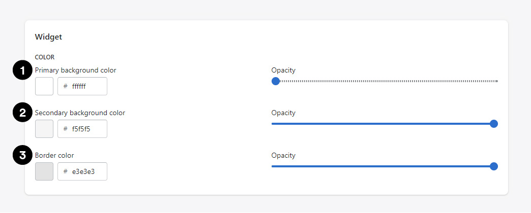
1. Primary background color
This background color is applied to the large areas of certain widgets. For example, the area of the Bundles widget on the Product page which displays, among other things, the product images.
2. Secondary background color
This background color is applied to the smaller areas of certain widgets. E.g. areas which serve as footer element like those at the Bundles or Frequently Bought Together widgets (table layout or mobile view).
3. Border color
Concerns borders around certain widgets or visual dividers.
Pop-up
Here you can make color settings for the Pop-ups. This does not affect the Widgets (placeable elements through the Shopify Theme Editor).
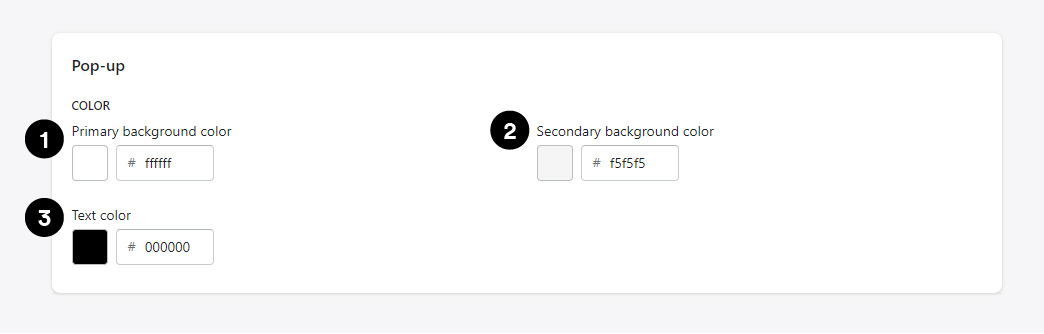
1. Primary background color
This background color is applied to the large areas of the Pop-ups. For example, the areas within the Product and Part page Pop-ups which list recommendations.
2. Secondary background color
This background color is applied to the smaller areas of the Pop-ups. For exmaple, the background area of the added products within the Product Page Pop-up.
3. Text color
Affects any text content inside the Pop-ups.