Pop-up (Product page)
The pop-up can be placed on the product page by using Shopify's app embeds in the Theme Editor, to display corresponding Recommendations and Upgrades to your customers inside the storefront.
Here we will only talk about the widget and its behavior in the storefront. If you want to know how to create Recommendations and Upgrades and add them to your storefront using the pop-up, take a look at the step-by-step guide for both:
Recommendations Guide
Upgrades Guide
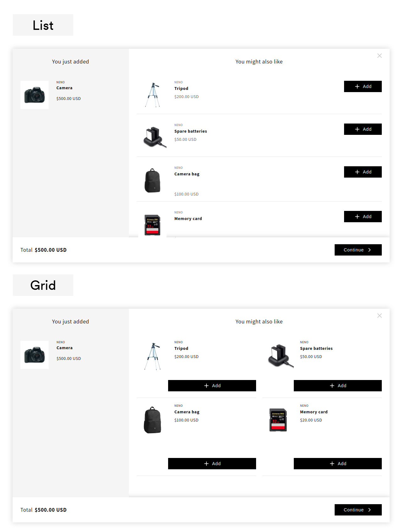
When the customer opens the product page and clicks on the Add-To-Cart Button the pop-up appears and show all Recommendations or Upgrades which are assigned to this product. If no Recommendations or Upgrades are assigned to this product, the pop-up does not appear. Two layout types are available for the Pop-up widget: List and Grid.
Desktop View
Within the area on the left, the main product is displayed. This area represents the temporary shopping cart. To the right, the respective Recommendations and Upgrades are listed, which can also be added. By means of the Continue Button, all possibly added products can be added to the actual shopping cart in parallel. Thus, the pop-up acts as an intermediary during the transition from the product to the cart page.
If you have assigned Upgrades, they can be marked with a special text within the buttons, e.g. Add Upgrade, in order to stand out from the Recommendations.

Mobile View
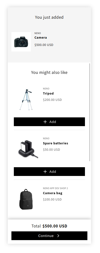
For mobile devices, all products are listed below each other. Added products are marked with Added within the Call-To-Action button. The two layout types are almost indistinguishable for mobile devices, so only one image is shown below, which represents both.
